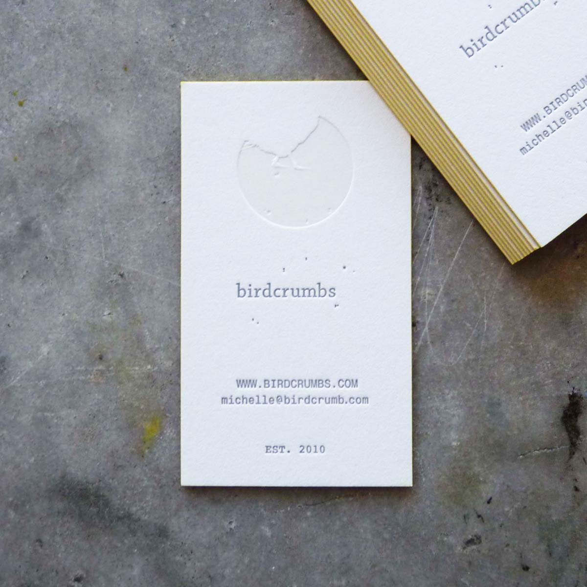
If the front side and the back side of a card are not enough, there are four more sides to work with: the edges. Edge painting can be matched to an existing color in the design or it can be done with a contrasting tone to add an unexpected pop of color. Finishing processes like this can really add polish to a card design.
Edge painting has a matte finish for the non-metallic Pantone colors and a shimmery finish for the metallics. If you’re looking for a very shiny metallic look, foiled edges are the way to go (more on that further down). For California Sunday Magazine we edge paint three edges of the card, leaving a white “spine” on one edge to suggest the magazine format. For Fuseproject we print a gradient of two colors from top to bottom, selected from their palette of seven “spectrum” colors.
This process is not perfect for everything, but when it is appropriate it can be an exciting and distinctive detail. Soft, muted colors tend to be hard to see, and bright vivid colors show up much better. We don’t edge paint on cards that have been die cut, as the edges tend to “wick” the ink instead of leaving it crisply on the edge. With very soft papers the ink can rub off, requiring careful handling of the cards and sometimes slip-sheeting.
When a shiny metallic finish is needed, foil edging is the best method. We outsource this process, so be prepared for longer turnaround. There is a range of foil colors available, however gold and silver are by far the most popular. There aren’t many things quite like opening a box of foil-edged cards and seeing a field of metallic staring back at you. {need a photo of foil edged cards!}.
Get in touch if you are in need of show-stopping business cards, or check out our wedding invitation designs or custom wedding invitation process.
Notes: Various papers used in the painted-edge stack, Huckabit business cards printed in three colors on 179# Crane Fluorescent White Kid finish cover. Gold-foil edged cards printed in two colors plus gold foil stamping on 110# Crane Lettra Fluorescent White cover.


